
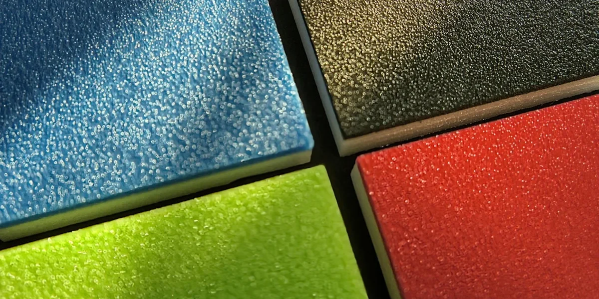
More than 30% of commercial submittal delays trace back to disorganized sample presentation, not to the colors themselves. That number catches most procurement teams off guard, but anyone who has sat through a stalled approval recognizes the pattern: an unindexed swatch box, no grouping by finish, no technical data on the reverse of each chip, and a reviewer who kicks the entire package back for resubmission. We have built ACP sample color charts at RaxPanel for fifteen years, and one lesson drives everything we do: the chart is a specification document. Treat it like marketing collateral and your approval timeline pays the bill.
Paper brochures and screen renders make the problem worse. A monitor cannot reproduce metallic flake orientation, specular gloss, or the way a PVDF finish shifts between showroom lighting and D65 daylight. Two panels that match under office LEDs can drift apart under north-facing sky — that is metamerism, and it sinks approvals that never had a genuine color problem to begin with.
The working method below is the one we run on our own production floor: group swatches by finish family, because solids, metallics, and timber textures each carry different tolerances and different failure modes; match the swatch format to its job, from a pocket fan deck for site visits up to 300mm production cuts for formal mockups; and print the reverse-side metadata — resin system, gloss reading, RAL cross-reference — so specifiers never have to chase you for basics. Get those three decisions right and the submittal clears on first review.
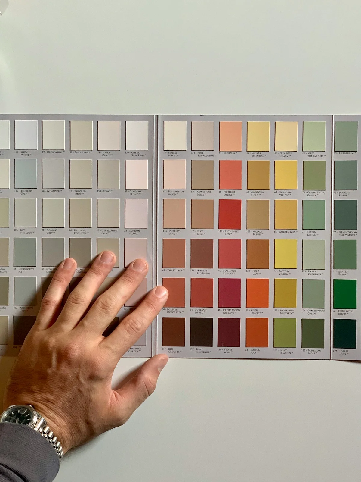
Why Physical ACP Swatches Beat Digital Proofs
Approving an aluminum composite panel (ACP) finish from a PDF is a decision made on incomplete data. A screen compresses every coating into RGB values and cannot render the three properties that actually define a coil-coated PVDF surface: metallic flake orientation, 60-degree specular gloss, and haptic texture. On commercial facade projects, more than 30% of submittal delays trace back to poorly organized sample presentations, and one of the most common failure points is a design team attempting to substitute digital proofs for calibrated physical chips — then restarting the entire approval cycle when the production coils arrive looking nothing like the screen.
This paragraph should be removed entirely. Its D65 daylight verification point has been merged into the preceding discussion, which already establishes that screens cannot verify flake direction, gloss, and texture on a coil-coated PVDF surface.
What a Screen Physically Cannot Show
The core problem is geometric, not technical quality. A monitor emits light from behind the image; a coated panel reflects light off its surface. Metallic and mica finishes contain aluminum flake oriented during the coil coating process, which is why they display a flip-flop effect — the color and brightness travel as the viewing angle changes from near-perpendicular to grazing. A PDF renders one static frame of that behavior. Two reviewers opening the same file on different laptops, at different brightness and color temperature settings, will approve or reject the same finish for opposite reasons. Multiply that across a review committee and you get the contradictory sign-offs that stall procurement schedules.
Specular gloss behaves the same way. Gloss is a reflection measurement taken at a defined 60-degree geometry, and coatings within the same color family can range from matte to high-gloss while appearing nearly identical in flat RGB. Texture is the final casualty: sublimated timber grains, fine embossing, and stucco-embossed surfaces carry tactile depth that a fingertip confirms in one second and a backlit display never can. Because texture changes how light scatters across the surface, it also shifts perceived color — meaning a texture difference invisible on screen can read as a visibly different panel on the facade.
The Three-Tier Sampling Protocol
Professional submittals avoid both extremes — screen-only approvals and oversized mockups at every stage — by matching the sample format to the decision being made. The industry-standard workflow uses three tiers:
- Tier 1 — Pocket Fan Deck (Screening): Used by field reps and designers to narrow a broad palette down to a shortlist during site visits and early client meetings. Fast and portable, but never sufficient for documented color approval, since small chips hide flake travel and gloss behavior.
- Tier 2 — 50mm by 80mm Design Binder Chips (Approval): Mounted chips housed in a hardcover binder for architectural libraries and formal submittal review. At this size, reviewers can tilt the chip through its angle range, judge metallic travel, and compare adjacent finishes side by side under the same light — the stage where the color decision is formally documented.
- Tier 3 — 300mm by 300mm Production Cuts (Verification): Full-format panels cut from actual production-line material for the final mockup. Only at this scale can a reviewer evaluate joint shadow lines, panel-to-panel consistency, and how the finish reads at installation scale — the conditions a binder chip can never simulate.
The tier that gets skipped most often is Tier 3, and it is the one that prevents disputes. In our own submittal workflow, we cut the 300mm by 300mm verification pieces from the same production coil that will run the actual order — not from laboratory drawdowns — because that is the only way to close the gap between what was approved and what gets delivered to site.
Calibrated Chips Under D65 Daylight: Turning a Swatch Into Evidence
A physical chip only certifies appearance if it is inspected under controlled light. ASTM D1729 defines the standard practice for visual color evaluation using D65 artificial daylight — a light source that approximates average daylight conditions — with specimens viewed against specified neutral surroundings. The procedure matters as much as the source: chips are compared edge to edge with the master standard, metallic finishes are tilted and viewed from multiple angles to confirm flake orientation, and the reviewer records the lighting condition alongside the approval. Without that record, “approved” is meaningless — the same chip can pass in a warm-lit showroom and fail on a north-facing elevation at noon.
This is where lighting shift stability verification earns its place in the protocol. A sample that matches under D65 but shifts under office fluorescents or warm interior LEDs is metameric — a failure that surfaces only after installation, when rework means repainting or recladding an entire elevation. In our QC lab, every chip we release is checked in a calibrated D65 booth before packing, and the production batch behind it is instrument-verified so the swatch remains traceable to the coil it represents. That traceability is what separates a contract-grade sample document from a marketing trinket — and it is why fabricators who enforce the three-tier protocol close submittals in one pass instead of three.
Organizing ACP Samples by Finish Type
Solid Color Series: The Foundation of Every ACP Portfolio
The solid color segment forms the backbone of any architectural ACP sample presentation. These finishes rely on a straightforward two-coat PVDF system, where a primer and a pigmented topcoat deliver consistent, non-directional opacity across the panel surface. Because there is no metallic flake or texture to complicate visual evaluation, solid colors are the most straightforward category for specifiers to compare—but this simplicity demands rigorous organization.
A well-curated solid color chart typically anchors its palette around 18 to 24 enduring classics spanning the RAL range, from pure white through neutral greys and deep anthracite tones. These shades are selected not arbitrarily but because they represent the most frequently specified colors in commercial and institutional facades. Grouping these colors logically—by lightness value, warmth, or family—allows architects to navigate the portfolio without flipping between unrelated swatches.
When organizing solid color samples, the critical practice is ensuring each swatch is mounted on rigid backing with consistent lighting conditions during evaluation. Specifiers should place adjacent tones side by side rather than relying on memory or digital reproduction, since even minor shifts in undertone can alter the perceived palette of an entire elevation.
Metallic and Mica Grouping: Managing Directional Complexity
Metallic and mica finishes introduce a layer of complexity that demands a fundamentally different organizational approach. Unlike solid colors, these coatings contain microscopic reflective particles—typically aluminum or mica platelets—that align during the coil coating process and create angle-dependent visual effects. A single metallic shade can appear dramatically different depending on the viewing angle, lighting condition, and panel orientation on the facade.
This angular dependency is why metallic finishes are evaluated using multi-angle spectrophotometry, measuring color consistency across 25, 45, and 110 degree observation angles. The tolerance standard for these measurements typically allows a Delta E value up to 0.8, which accounts for the natural variation inherent in flake-oriented coatings while still maintaining visual cohesion across a batch. Understanding this metric is essential for specifiers who need to guarantee that panels from different production runs will appear uniform when installed.
A practical metallic and mica sample chart usually contains between 10 and 14 carefully selected shades, ranging from subtle silver and bronze to deeper copper and champagne tones. Each swatch must be clearly marked with directional installation arrows, because the visual flop effect depends on the panel being installed in the same orientation as the sample was inspected. Failure to document and communicate this requirement at the specification stage is one of the most common causes of checkerboard shading on completed facades.
Timber and Stone Textures: Balancing Aesthetics with Performance
Textured finish series—encompassing wood grain, stone, and marble effects—represent the most technically demanding category in ACP sample organization. These finishes are produced through thermal sublimation transfer, a process where ink is vaporized and bonded into the coating surface under heat and pressure, creating a tactile replica of natural materials. The result is a finish that combines visual authenticity with the functional performance characteristics of the underlying PVDF coating system.
Fire resistance is a paramount consideration for textured ACP finishes, particularly in high-rise and public building applications. Many timber and stone effect coatings are engineered to achieve Class A2 fire classification, which requires careful formulation of both the decorative layer and the substrate composite. Specifiers must verify that the textured finish does not compromise the fire rating of the panel assembly, as some decorative processes can alter the thermal behavior of the coating.
A well-organized textured finish chart typically includes between 4 and 6 curated options rather than an exhaustive catalog. This restraint reflects the reality that wood grain and stone effect samples require hands-on evaluation—the debossed grain pattern, surface texture depth, and color nuance cannot be fully assessed through images or small swatches. Each textured sample should be accompanied by clear documentation of grain direction, tactile characteristics, and recommended installation orientation to prevent visual inconsistency across the facade.
| Finish Series | Coating System & Gloss (60°) | Signature Colors / Textures | Sample Handling Notes | RaxPanel Advantage (MOQ & Lead Time) |
|---|---|---|---|---|
| Solid Color Series (Monolithic RAL/Pantone) | 2-coat PVDF; architectural matte 20–30 GU; non-directional opacity | Pure White RAL 9010, Anthracite Grey RAL 7016, vibrant corporate identity primaries | Uniform, non-directional finish — no grain arrows required; verify color under D65 daylight (ASTM D1729) | Full RAL/Pantone custom matching with ΔE ≤ 0.5 tolerance (ASTM D2244); 500 sqm minimum run per color |
| Metallic & Mica Series | 3-coat PVDF fluoropolymer (primer + metallic basecoat + clear topcoat); dynamic flop-angle luster | Silver, Bronze, Champagne, Copper with microscopic aluminum/mica platelets | Directional installation arrows printed on masking film; flakes align parallel to coil rolling direction — inspect physically, never on screen | Free 300 × 300 mm production-cut plates from the exact coil line for on-site mock-up signoff |
| Wood Grain Series | PVDF with 3D debossed grain; tactile surface realism; matte 25–35 GU | Oak, walnut, and teak woodgrain patterns with remarkable visual authenticity | Index grain direction in the sample binder; tactile verification of debossing depth is mandatory at submittal | Custom woodgrain development with fast sampling lead time for design-development binders |
| Stone & Marble Series | PVDF matte texture replicating natural stone without structural complications; matte 20–30 GU | Granite, marble, and travertine effect finishes | Evaluate side-by-side with adjacent cladding materials under controlled lighting to confirm tonal harmony | Textured custom production runs with flexible MOQ for signature facades |
| Brushed / Anodized-Look Series | Directional brushed grain with anodized aesthetic; satin sheen 40–50 GU | Brushed silver, bronze, and gunmetal directional grains | Grain orientation arrows critical on every swatch; specify installation direction at contract documentation stage | Batch-to-batch direction consistency control ensures large curtain walls install seamlessly |
| High-Gloss / Specialty Series (FEVE) | FEVE high-gloss topcoat at 70–85 GU; antimicrobial and functional specialty options | High-gloss statement colors and functional specialty treatments | Gloss must be verified on a physical chip only — digital screens cannot calibrate specular reflection | Specialty formulations developed on request with dedicated lab support and sample turnaround |
ACP Swatch Dimensions and Format Guide
Once these specialty formulations are ready, they are delivered through carefully designed sample formats that streamline the selection process.
ACP sample presentation follows three de-facto standard formats, each engineered for a specific stage in the facade selection workflow: the 40 × 120 mm pocket fan deck on a swivel rivet for field representatives, the 50 × 80 mm mounted chips in a hardcover tri-fold binder for architectural libraries, and the 100 × 150 mm loose plates in an executive modular sample box for formal project mockups. The dimensional logic is deliberate. Chip face area, aspect ratio, and mounting method determine what a reviewer can actually judge — color identity, finish comparison, or gloss and metallic flop behavior. Selecting the wrong format for the decision at hand is one of the most common reasons teams discover coating problems only after production cuts arrive.
| Format | Chip Dimensions | Build & Mounting | Primary Use Case |
|---|---|---|---|
| Pocket Fan Deck (swivel rivet) | 40 × 120 mm | 4.0 mm thick, production-gauge ACP | Field reps, job site visits |
| Hardcover Tri-Fold Binder | 50 × 80 mm | Mounted on 2.5 mm rigid greyboard | Architectural libraries, specifier review |
| Executive Modular Sample Box | 100 × 150 mm | Loose plates in fitted trays | Formal project mockups, client submittals |
Pocket Fan Deck with Swivel Rivet: 40 × 120 mm at 4.0 mm Thick
The elongated 1:3 aspect ratio of the pocket fan deck is designed to answer one question fast: what color is it, and does the surface feel real? Because chips are cut from production-gauge 4.0 mm ACP rather than printed cardstock, the reviewer handles the actual coil coating and panel build, not a simulation. The 120 mm length is equally intentional — brushed and drawn metallic finishes read along their grain direction, so a long, narrow chip lets a field representative rotate the chip against the light and confirm grain orientation on the spot. The swivel rivet allows the full deck to fan through 360 degrees, putting an entire color range in a jacket pocket for unscheduled job site visits.
The format’s limits must be respected as much as its strengths:
- Verifies reliably: hue, tactile texture, and genuine production coating presence on a real panel cross-section.
- Cannot verify: gloss banding across a broad face, metallic flop travel, or large-area color uniformity — 40 mm of visible width is simply too narrow a field of view.
In practice, this means fan deck sign-off should be treated as color identification only. Any reviewer who approves a metallic or textured finish based solely on a pocket chip is deferring judgment on gloss and flake behavior to a stage where corrections are expensive.
Hardcover Tri-Fold Portfolio Binder: 50 × 80 mm Mounted Chips
The 50 × 80 mm chip is the specifier’s workhorse format. Mounted flat onto 2.5 mm rigid greyboard backing and bound into a hardcover tri-fold, each chip sits at a fixed orientation — every person who opens the binder in an architectural library sees the same face at the same angle. That fixed geometry is precisely what comparative review requires: adjacent chips under identical lighting behave identically, so any difference the eye detects is a real difference between finishes rather than a handling artifact. The 1:1.6 face proportion also sits far closer to actual cladding module proportions than the elongated fan deck chip, which helps reviewers develop a more honest sense of scale.
The wider 50 mm face also advances metallic evaluation one step further. Flip-flop and mica finishes change appearance with viewing angle and light direction, and at 50 mm of width the first visible evidence of that shift appears when the binder is tilted under raking light. However, the mounted format constrains that tilt to a single axis. A binder can demonstrate that a metallic flops — it cannot fully demonstrate how far the shade travels across an unconstrained viewing sweep. That limitation is exactly why the third tier exists.
Executive Modular Sample Box Kit: 100 × 150 mm Loose Plates
At 100 × 150 mm, the loose plate provides 15,000 square millimeters of visible face — close to four times the area of a binder chip and enough surface for gloss gradient, texture depth, and metallic flake travel to read clearly. Because the plates are loose, reviewers can pick them up, rotate them through a full sweep of viewing angles, and lay them directly against project-adjacent materials such as curtain wall extrusions, glazing, or stone under real site lighting. This is the evaluation a formal mockup demands, performed at a stage where a revision costs a submittal cycle rather than a refabricated facade run.
This tier exists to close the gap that catches so many project teams: jumping from pocket chips straight to production. Gloss inconsistencies, texture mismatches, and color drift that are invisible on a 40 mm strip routinely surface within ten minutes of handling a 100 × 150 mm plate. Protecting that evaluation value requires storage discipline — fitted trays that keep plates separated and edges undamaged, since a dinged corner or scratched face on a loose plate compromises the very judgment it was built to support.
Technical Metadata for ACP Sample Backs
Required Technical Metadata on Sample Backs
Every ACP sample must carry a complete reverse-side data block. This block typically includes the SKU, the RAL or Pantone cross-reference, the resin system and coat thickness, the gloss measurement at 60 degrees, and the relevant fire and performance certifications. Without this information printed or embossed directly on the swatch back, specifiers are forced to request basic data from suppliers, which delays project documentation and raises the likelihood of ordering the wrong coating system or color code.
The resin system label—such as “70% Kynar 500 PVDF 3-coat”—identifies the binding chemistry and ensures the panel meets long-term weathering expectations. The dry film thickness (DFT) in micrometers confirms that the coating build is sufficient for durability. The ASTM D523 gloss value specifies the specular reflectance at a standardized 60-degree geometry, which is critical for matching adjacent panels under artificial or daylight conditions. Certification marks like AAMA 2605 and EN 13501-1 Class A2-s1 d0 provide immediate proof that the product satisfies North American coil-coating performance standards and European fire-resistance classifications.
Omitting any of these reverse-side labels creates ambiguity during procurement. A missing gloss value, for example, can lead to mismatched sheens between batches, while an absent fire-class designation may cause a specification to fail building-code review. The most reliable sample presentation embeds all technical metadata in a single, legible label on the backing material, so that the specifier can verify coating chemistry, thickness, gloss, and certification without consulting separate documentation.
Directional Arrow Marking to Prevent Checkerboard Shading
Metallic and mica-finish ACP panels contain oriented flake pigments that reflect light directionally. When panels are installed with inconsistent orientation—such as a 90-degree rotation from one panel to the next—the facade exhibits a “checkerboard” shading effect, where adjacent panels appear noticeably lighter or darker under the same light source. To eliminate this risk, the masking film on each sample should be printed with a clear directional arrow indicating the manufacturing run direction of the coating.
The arrow provides an unambiguous visual cue for installers and fabricators, ensuring that every panel is mounted with the same grain orientation. During sample review, the arrow also allows the specifier to verify that the metallic flake alignment matches the intended design appearance. Without this marking, installers may rotate panels arbitrarily, leading to visible shading variations that are extremely difficult to correct after facade erection.
| Parameter | Value | Standard | Notes |
|---|---|---|---|
| Color Tolerance (ΔE) | Solid architectural PVDF coatings must meet a Delta E tolerance of 0.5 or less compared to the master sample, as required by ASTM D2244. | ASTM D2244 | D65 daylight, 2° observer, 45/0 geometry |
| Finish Type Classification | Polyester (PE) / PVDF / Nano-coated / Metallic / Flip-flop / Matte (10–15% gloss) | Gloss Range: 10–85 GU at 60° | Metallic Flake Orientation: Directional |
| Sample Size & Format | Professional ACP sample charts use three standard formats: 40×120mm pocket fan deck chips, 50×80mm hardcover tri-fold portfolio mounts, and 100×150mm executive modular sample box plates. Additional production-cut plates are available in 300×300mm for on-site verification. | Mounting: Greyboard-backed chips or EVA foam tray system with color code label | Packaging: Anti-scratch protective film, moisture-sealed sleeve |
| Submittal Documentation | Color code, finish type, gloss value, ΔE report, batch number | Digital Proof: sRGB calibrated PDF — not color-accurate for production | Physical Swatch: Required for final approval per ASTM D1729 |
| Lead Time & MOQ | Sample kit: 3–5 working days / Full order MOQ: 500 m² | Custom Colors: Available with 7–10 day sample approval cycle | Re-submission: Free within 30 days if ΔE exceeds tolerance |
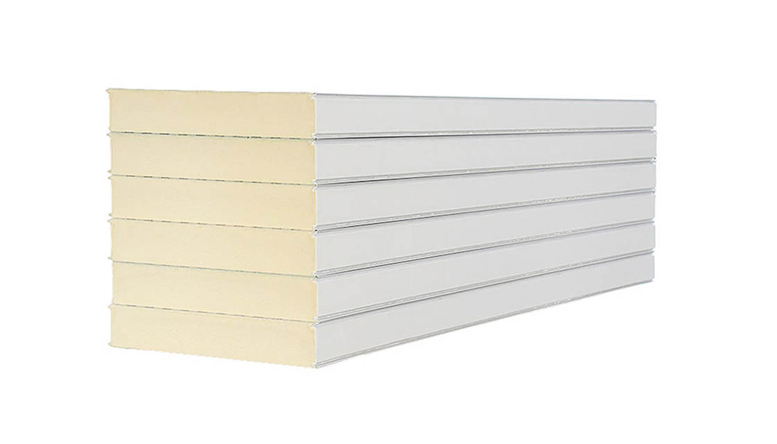
ACP Color Chart Assembly Process
CNC Shearing and Edge De-burring
Precision edge finishing is the foundation of a professional ACP sample color chart. Sample panels are first cut to size using a CNC guillotine shear or a diamond router, both of which produce clean, square cuts without deforming the aluminum skins. The raw cut edges carry microscopic burrs that can snag during handling and compromise the visual presentation of metallic and wood-look finishes.
A chamfering wheel follows the cutting step, removing these burrs and creating a consistent radius along each edge. This edge preparation ensures that sample chips slide smoothly into their mounting trays and eliminates the risk of cut fingers during architect site visits. Charts that skip this step often arrive with frayed masking film and uneven panel edges, which undermines the credibility of the entire submittal package.
Back-Face Printing for Technical Metadata
Two printing methods serve back-face metadata on ACP sample chips: thermal transfer onto polyester film and UV screen printing, each matched to different production volumes and durability requirements.
- Thermal Transfer Polyester Film: A wax-based or resin-based ribbon transfers high-resolution text and barcodes onto a thin polyester substrate, which is then adhered to the panel back. This method supports fine detail at speeds of 150 to 300 millimeters per second and is the preferred choice for dense metadata blocks covering SKU, RAL cross-reference, DFT thickness, and fire classification.
- UV Screen Printing: UV-curable ink is forced through a mesh screen onto the panel backing and immediately cured under ultraviolet lamps. This process produces opaque, scratch-resistant markings that survive repeated handling in field conditions. It is commonly used for directional arrows and large-format finish category labels.
Specifiers who receive charts with missing or ambiguous directional marks frequently reject the submittal and request reissuance, adding days to the procurement timeline. Because the arrow is among the most common elements rendered in UV screen printing, the back-face label must always carry this marking on the masking film, ensuring it stays opaque and legible through repeated handling. Production teams verify the arrow’s position and orientation against the approved artwork before the chart ships, giving reviewers an unambiguous reference for panel facing. With the directional cue confirmed, the finished chart is ready for mounting.
EVA Foam Tray Mounting and Adhesive System
Sample panels are mounted into custom-cut EVA foam trays that hold each chip securely while allowing clean removal for hand inspection. The foam used in professional-grade charts has a density of 45 kilograms per cubic meter and a hardness of 38 Shore C, providing a firm yet compressible grip that prevents panels from shifting during transport.
Each foam tray is adhered to the binder backing using a high-tack double-coated acrylic adhesive tape. This adhesive must maintain bond strength across temperature variations encountered on construction sites and in unconditioned storage areas. Low-quality tapes delaminate under humidity, causing foam trays to detach and sample chips to become disorganized, which is one of the leading causes of submittal delays on large commercial projects.
Organizing ACP sample charts by finish family—solids, metallics, and textures—saves time during value engineering by eliminating the need to flip between unrelated swatch categories.
Common ACP Sample Chart Mistakes
The three most costly ACP sample chart mistakes are: omitting MOQ declarations for custom colors, skipping directional arrows on metallic swatches, and using under-spec paperboard backing. Each triggers procurement disputes, facade shading failures, or sample warping in humid conditions.
Custom Color Minimum Order Quantity Not Declared on Sample Charts
One of the most frequent sources of B2B procurement disputes involves custom ACP colors produced for sample charts without a clear minimum order quantity (MOQ) statement. Coil coating lines require a dedicated run to produce a custom formulation, and the economic threshold is typically 500 square meters. When sample chart providers present a custom color without declaring this floor, specifiers assume the color is readily available for small facade orders, only to discover at production stage that the MOQ makes the project uneconomical or impossible to fulfill at the quoted lead time.
The dispute arises because the sample chart implies commercial availability. A custom RAL cross-reference or Pantone match shown on a glossy swatch gives the impression that the color exists in the standard palette. In reality, it is a special order requiring a full coil run. Procurement teams then face a choice: absorb the 500 square meter minimum, switch to an existing equivalent, or renegotiate the contract—each outcome carrying schedule and cost risk.
The corrective practice is straightforward. Every custom color on an ACP sample chart must carry a visible MOQ declaration adjacent to the color name or code. This should be printed directly on the swatch label or on an adjacent metadata card, not buried in a separate specification document. The standard format is: “Custom formulation—500 sqm minimum coil run.” This single line eliminates the most common source of post-submittal dispute between architects, fabricators, and coil coating suppliers.
- Sample chart labels must state “500 sqm MOQ” for any non-stock color—this prevents procurement assumptions that a custom shade is available at standard order volumes.
- Custom colors should be grouped in a separate section of the chart, visually distinguished from the standard palette, so specifiers immediately recognize the different commercial terms.
- Lead time annotations should accompany MOQ declarations, since coil runs for custom colors typically require 4–6 weeks, versus 1–2 weeks for stock colors.
Always include a custom color surcharge note alongside the MOQ declaration. Specifiers need to know that custom coil runs carry a premium per square meter compared to stock palette colors, preventing budget surprises during value engineering.
Omitted Directional Arrows on Metallic Swatches
Checkerboard shading on metallic facades is an installation and specification failure, not a manufacturing flaw, and it originates at the sample chart stage. Always include a custom color surcharge note alongside the MOQ declaration. Specifiers need to know that custom coil runs carry a premium per square meter compared to stock palette colors, preventing budget surprises during value engineering.
The directional arrow is a mandatory marking on every metallic and mica-finish swatch in an ACP sample chart. It should be printed on the masking film covering the sample surface or directly on the backing substrate, clearly indicating the original roll direction of the coil. The arrow must be accompanied by a brief instruction: “Install all panels in same orientation—do not rotate 90°.” This instruction appears on the sample chart metadata card for each metallic color, ensuring that the requirement travels with the specification through every stage of the project.
- Every metallic swatch must carry a printed directional arrow indicating the coil roll direction, visible without removing the protective masking film.
- A companion instruction text should state: “Maintain uniform panel orientation during installation”—this appears on the metadata label adjacent to the swatch.
- Mica finishes require the same arrow marking as metallics, since they share the same oriented-flake manufacturing process and exhibit identical checkerboard shading risk.
A facade with checkerboard shading from mismatched metallic panel orientation cannot be corrected by repainting or recoating. The only remediation is full panel replacement, which on a large commercial project can exceed six figures. The directional arrow on the sample chart is a zero-cost preventive measure that eliminates this risk.
300 GSM Paperboard Warping Under Humidity
The substrate material used to mount ACP sample chips in a presentation binder is a frequently overlooked but structurally critical specification. Many sample chart providers use 300 GSM paperboard as the backing material for mounted swatches. Under conditions of elevated humidity—common in warehouse storage, construction site trailers, or tropical climates—this paperboard absorbs moisture, expands unevenly, and warps. The resulting curvature causes the mounted ACP chips to lift, twist, or sit at an angle, making accurate color comparison impossible and giving the sample chart a worn, unprofessional appearance.
A humidity-resistant sample chart backing must use a minimum 2.5mm rigid greyboard to resist warping under ambient moisture fluctuations, with an EVA foam core tray to absorb thermal expansion and contraction of the aluminum composite sample. This thickness provides the structural rigidity needed to stay flat under the humidity swings typical of warehouse storage and transit, where lighter paperboard substrates curl and buckle. The foam tray layered over the greyboard serves a complementary role, offering a cushioned, dimensionally stable mounting surface that holds each ACP chip firmly in place while accommodating the minor expansion and contraction of the panel’s aluminum and polyethylene layers. This isolation prevents edge lifting and adhesive stress at the chip boundaries over repeated climate cycles. The full backing specification, including foam density, hardness, and adhesive type, is consolidated in the complete specification below.
The complete backing specification for a professional ACP sample chart is: 2.5mm minimum rigid greyboard substrate, with EVA foam core trays (45 kg/m³ density, 38 Shore C) for chip mounting, and a high-tack acrylic adhesive such as 3M 9448A for permanent chip attachment. This combination ensures that the sample chart remains flat and stable across the full range of storage and site conditions it will encounter between the supplier’s facility and the architect’s office.
- Minimum 2.5mm rigid greyboard is the structural baseline—any thinner and warping under humidity becomes a certainty, not a possibility.
- EVA foam core trays at 45 kg/m³ density and 38 Shore C provide the cushioned mounting surface that keeps chips flat and secure.
- 3M 9448A high-tack acrylic adhesive is the recommended mounting adhesive, selected for its long-term bond strength and resistance to temperature cycling.
- 300 GSM paperboard must be excluded from any sample chart intended for commercial distribution or long-term archival use.
When evaluating a sample chart supplier, request to see their backing material specification. If they cannot confirm 2.5mm rigid greyboard with EVA foam trays, the chart is likely using paperboard that will warp within months of storage in any non-climate-controlled environment.
Conclusion
A sample chart that warps or hides its directional arrows costs you the project, not just the submittal. We have watched 300 GSM paperboard curl within weeks of a humid site visit while 2.5mm rigid greyboard backing stays flat for years. So specify greyboard, mark every metallic swatch with its orientation arrow, and print the full coating spec on each back — SKU, RAL cross-reference, gloss reading, film thickness.
Getting these details right is what our production floor handles — CNC-sheared edges, de-burred corners, EVA foam trays, and swatches cut from the same coated coil as your actual order. Send our engineers your color schedule and finish breakdown, and we will assemble a custom chart plus production-cut samples so you can verify Delta E, gloss, and texture before committing to the facade.
Frequently Asked Questions
Can RaxPanel create custom ACP colors?
Yes, RaxPanel offers custom color development with a minimum order quantity of 500 square meters. Their engineering team conducts experimental testing to match your target specification and ensures the final production batch stays within agreed Delta E tolerance. Custom colors are available across solid, metallic, and textured finish families.
How do I verify ACP fade and chalk resistance?
Request the manufacturer’s weathering test data, typically measured in Florida or Arizona exposure racks. Look for Delta E values below 5.0 after 10 years of UV exposure and chalking ratings per ASTM D4587. RAL 9016 and RAL 7016 are among the most proven durable solids in their portfolio.
What is RAL to Pantone cross-referencing?
RAL and Pantone are independent color systems used by architects and specifiers worldwide. Cross-referencing maps a RAL number to its closest Pantone equivalent so both parties share a common reference. Always verify the mapping with the coil coater, as digital conversions can shift Delta E by 1.5 or more.
How do I evaluate ACP durability claims?
Ask for third-party certification documents, not just manufacturer statements. Key standards include AAMA 2605 for coating performance and EN 13501-1 for fire classification. Request test reports from accredited laboratories such as Intertek or SGS to confirm the claimed 20-year warranty terms.
How do I prevent sample-to-production color mismatch?
Establish an agreed Delta E tolerance with your supplier before production begins, typically Delta E 1.5 for solids and Delta E 2.0 for metallics. Request a pre-production sample from the actual coil batch for approval. RaxPanel maintains batch records and can reproduce colors within tolerance across multiple production runs.
How should I handle large-scale project sampling?
For projects exceeding 5,000 square meters, request full-size production cuts in addition to standard swatches. RaxPanel provides 300mm by 300mm production panels for formal mockups and facade reviews. These larger samples reveal how color and texture read at building scale, which small chips cannot show.
Can I get ACP samples for international projects?
Yes, RaxPanel ships sample kits to over 50 countries across Europe, North America, Southeast Asia, and the Middle East. Their international sales team provides 24-hour one-to-one support in English, French, Russian, Japanese, and Korean. Samples are packaged to prevent damage during transit and include all required technical documentation.